Mobile Web

Mobile web usage is rapidly increasing on both tablets and smartphones. The multitude of different screen shapes and sizes, along with the touch-screen interface presents a significant challenge to web developers.
All websites today need to have a mobile strategy.
The modern approach is responsive design. This means there is only one version of the website, but it adapts automatically to the screen size of the device in use. It can therefore show itself in different layouts and sizes to make the maximum use of the available screen space and offer full access to all features of the site.
Over the last 5 years or so the approach was to have a completely separate version of the website shown to mobiles, but with the increasing range of different devices and screen sizes this often leads to a very poor user experience, and users frustrated at the reduced features.
Mobile Apps
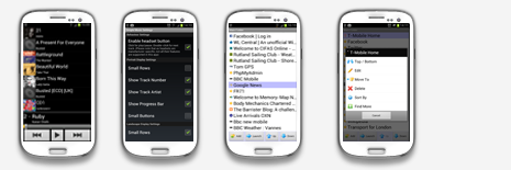
For most businesses a properly designed and built mobile website is sufficient, but for some projects a mobile app can make your business stand out.
We develop native apps for Android tablets and phones in-house, and we can project-manage the outsourcing of iPhone, iPad and other platform development for you.